Type: Work
Source: Available Fonts
Annotator: Stephanie Straine
Sequence: 1 of 6
Year annotated: 2020
Type: Exhibition
Source: Available Fonts
Annotator: Stephanie Straine
Sequence: 2 of 6
Year annotated: 2020
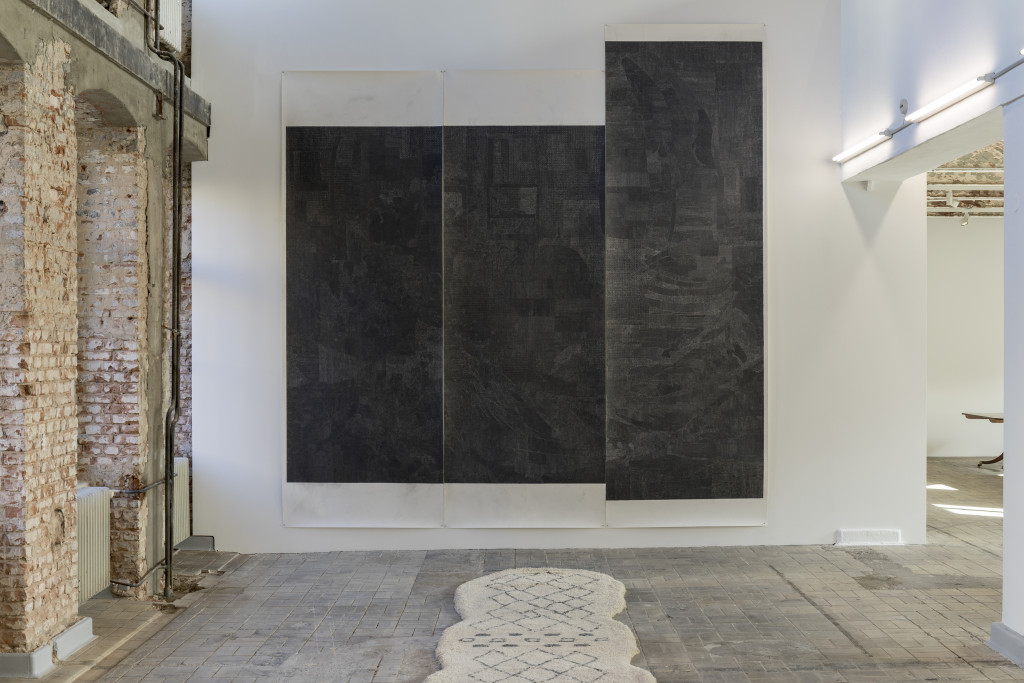
If Available Fonts extrapolates from the artist’s archive of black drawings in fragmented and miniaturised form, then Untitled (Black Drawing) acts as the drawings’ residual inventory. This immense three-part work revisits the series in overlay, reanimating black drawings from 2008 and 2009 that utilise a limited range of abstract marks and shapes. These marks and shapes collectively aggregate versions of recognisable objects and artworks (from a natural history museum’s monumental whale skeleton to Hokusai’s The Great Wave and A Deluge drawing by da Vinci). This secondary accumulation from 2015 again asks us to re-negotiate the very act of looking, by presenting images as a disrupted and scrambled field, in which the superimposed sources are ambiguously suspended between abstraction and representation. Drawing becomes a language that is both polluted and precise.
Across her wider drawing practice, Skaer always utilises found images that emerge from long periods of research: she never works directly from the object itself, but instead uses secondary photographic sources that she can enlarge, copy, simplify or break down into constituent parts. Her drawings are therefore copies of copies, and reproductions of reproductions – a working through of different systems of imaging. She creates the conditions that allow for abstraction (but not the abstract, per se), difficulty and failure of recognition to flourish within the spaces of drawing. A gesture of refusal that is also the opening of a door.
Type: Exhibition
Source: Lucy Skaer at the Fruitmarket Gallery
Annotator: Stephanie Straine
Sequence: 3 of 6
Year annotated: 2020
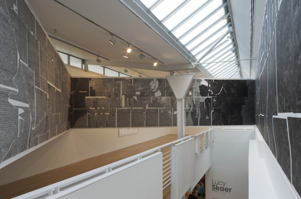
I remember this contradictory feeling of weightless suspension and imposing, almost aggressive, mass. A redrawing of the gallery’s architecture. The sudden appearance of new edges, planes, and volumetric space. That sensation of being – only partially – inside a drawing that overwhelms in its scale, its disorienting placement, and its refusal to be digested in a single glance or from a static viewpoint. Perched atop the central stairwell, jutting out into shaped space at odds with the floorplan’s intentions, it felt like something simultaneously ancient and futuristic. A lexicon of technical manufacture and bodily suture. A drawing that overwhelmed the scale of the individual, that denied much in the way of close observation, but that was inescapably made by hand. A building made out of paper that was anything but fragile.
It was clear to me then, as it still is now, that Skaer approaches drawing not as a separate medium, but as a method of working through a ‘limited visual vocabulary’ that is in essence about establishing a set of conditions. Certainly, her drawing practice (and its strong affiliation with her printmaking) opposes the logic of the preparatory sketch. It recognises the capacity of drawing to offer complexity, particularly in relation to duration and working/re-working in series – or as sentences.
Type: Exhibition
Source: Available Fonts
Annotator: Stephanie Straine
Sequence: 4 of 6
Year annotated: 2020
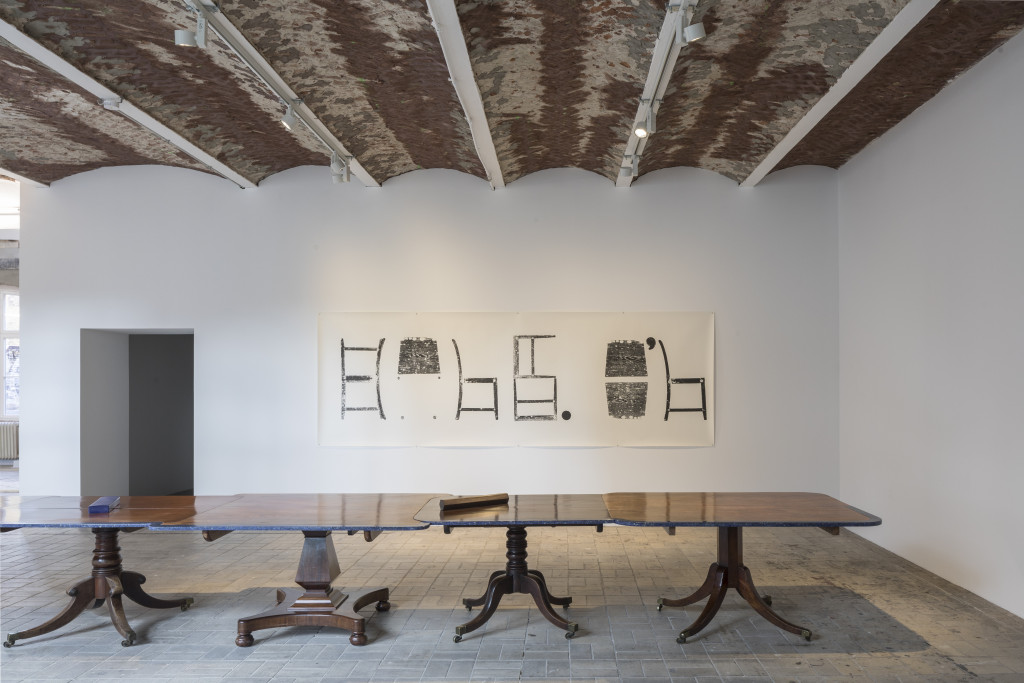
This is a work originally made for the Turner Prize group show in London, 2009, as seen restaged in an image documenting the installation of a solo exhibition in the winter 2017/18 in Berlin, called Available Fonts. The artist’s titles often migrate across years from artwork to exhibition and back again, as they invoke real world referents to then make shaky our connection to such things. Like the prints of the same title, the components of this exhibition moved both backwards and forwards in time, sashaying between new and old, word and image, to shake off anything resembling a fixed binary.
Skaer has said that her practice often considers language from a position ‘outside of it.’ This print from 2009, Thames & Hudson, is concerned with such exteriority. It produces a ‘visualisation of language’ via an operation of substitution. The work cycles through the full set of contact print options made available from the surfaces of a single household chair. In horizontal alignment the sequence of printed shapes evokes the curves and dashes of letters and words, with punctuation marks to be found in their logical place. Skaer extracts a pictographic quality from this utilitarian item of furniture in a manoeuvre of slippage and of semaphore. The object is both suddenly immaterial, lost to language, and vividly, materially palpable for us. If syntax is an abstraction of the tallest order, then we must realise how close we are to losing all sense of understanding, of situatedness. Language is the less-than-stable ground that we all walk upon.
Type: Exhibition
Source: Blanks and Ballast
Annotator: Stephanie Straine
Sequence: 5 of 6
Year annotated: 2020
Originally shown lying on the floor, unmounted and unframed, the silkscreened works in this series capture a moment of escape: the figure slipped from the frame. The diamond pattern of the Harlequin is on repeat: both abstract and referential at once, it stands in for the jester, the fool – medieval agents of chaos that delight in giving authority the slip (the artist has more recently looked at other examples of such utopian personifications, like the Green Man).
Skaer tumbles again into a world of images that are themselves images – in the form of print media reproductions of Renaissance paintings from the National Gallery, London. The central figure or portrait is expunged, leaving only their silhouette and its monochromatic background to interact with the diamond interstice. Absence inverted.
We are returned to image scrambling (past works and art historical source materials are treated equally in this regard), and the subversion of any clarity of vision. There are perhaps even methodologies of translation at work in these upside-down spaces and uses for images. As an area of friction between two languages, the very notion of translation accepts both interstice and interference: the gaps in meanings and comprehensions that contour Skaer’s interest in nonsensical expressions of and experimentations with language. Translation demands a condition of slippage, ambivalence or openness. It might even be a means of escape.
Type: Work
Source: Guardian newspaper prints
Annotator: Stephanie Straine
Sequence: 6 of 6
Year annotated: 2020
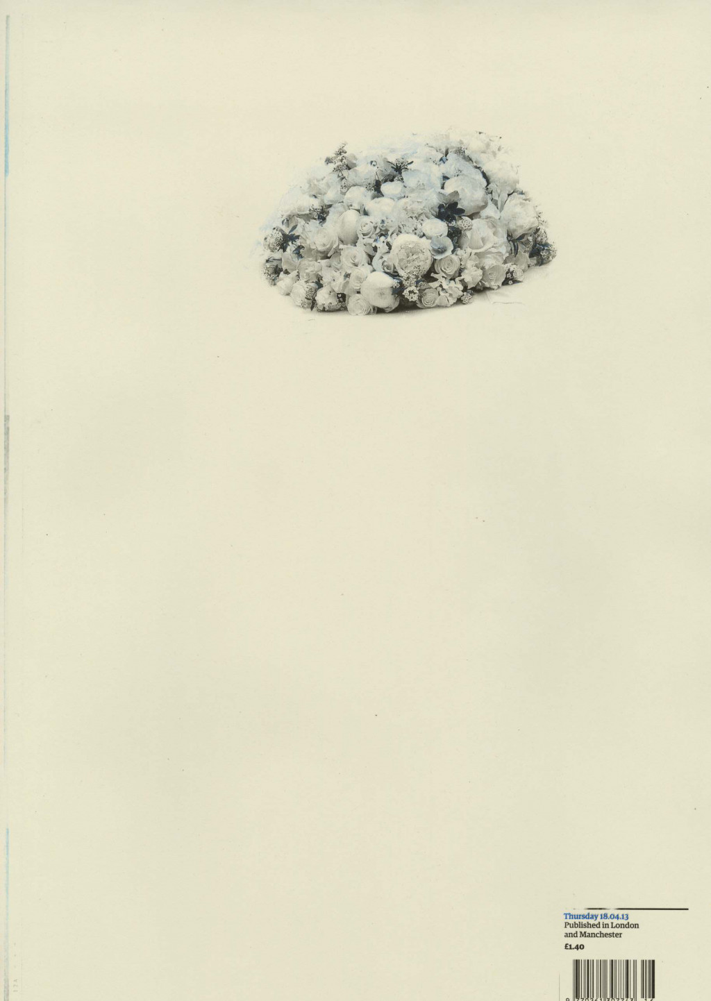
I am convinced every time I look at this work that the partial image it contains is a fragment of bleached coral reef – of something quasi-magical and imperilled from the sea. I know that on closer inspection Skaer’s lithograph reveals the marooned image to be of a voluptuous bouquet of flowers. Bereft of all context, all text, formatting and newspaper layout (save the tiny barcode area in the bottom right), my mind keeps struggling to recall the detail that these are flowers of mourning from the funeral of former Prime Minister Margaret Thatcher that took place on 17 April 2013, the day before this newspaper was printed and published. In a sense, my reaction of forgetting and invention dramatizes the artist’s actions as a means of escape. Her reuse of and hand-printing from the original metal lithographic plates of The Guardian newspaper offers these journalistic images an escape into another possibility. There is something profoundly intimate about this reprographic gesture. Equal parts reparative and transformative, the thrilling instability of the image is cocooned by its paper ground.
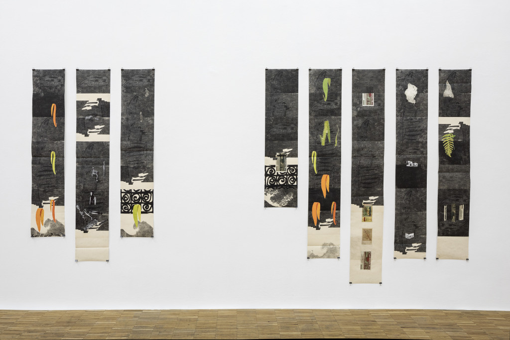
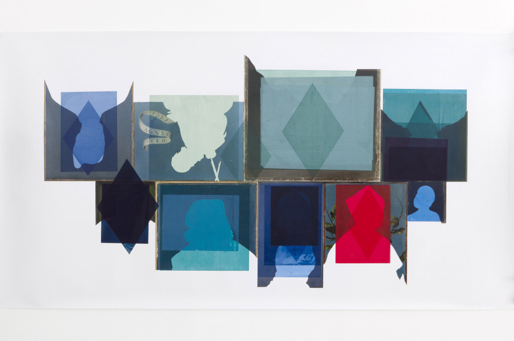
I keep circling back to Available Fonts, drawn to its complexity, its familiarity and strangeness. My annotations need to start (or maybe they should end) with this family of ten collage/print hybrids. They are both a conclusion and a beginning for stories half told and half remembered. Stories that shake off written expression; that exist only as visual traces. It’s hard to exhaust these papery distillations of impressions, ideas and images. The backbones of these prints are shrunken versions from Skaer’s archive of black drawings completed in the decade or so prior to 2017. They utilise a notational and poetic vocabulary evasive of language as communication. Resizing, reworking and reassembling diverse source imageries, the prints’ processes of image scrambling promote instead a relationship to our more nonsensical iterations of language.
As part of the research process for this series, Skaer worked with printers in Northumberland specialising in security printing for currency and passports. This company can achieve incredibly detailed image printing, even at a scale invisible to the naked eye. Although Available Fonts was ultimately printed at Dundee Contemporary Arts’ Print Studio, she pursued this idea to ‘shrink’ the content of her earlier black drawings; to rework them as prints whose learnt behaviour stems from the microprinting and latent imagery of economy and industry.
The prints might appear as resolutely two-dimensional from these website photographs, but their physical reality occupies a quasi-sculptural space of undulation, of overlaps, of glued joints and creases; of paper as it expands and contracts according to the compressions of the printmaking press and the varying environmental conditions of subsequent storage and display. Each plate section requires a suture to its neighbour, so that as a vertical stack they rise and fall in recognition of the support’s erratic physicality. Then there are the secondary feuilles of the nineteenth-century ferns, votives from the Seine, German banknotes – the layer of superimposed elements that flicker and flutter against the printed concentration of drawings-in-miniature.